onest.
The taste of honesty: a natural alternative to traditional energy drinks.
Context
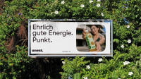
How do you disrupt one of the fastest-growing yet most saturated categories in the beverage industry? This was the question the founders set out to answer. Their vision: to create a new kind of energy drink – one built on honest ingredients, transparent communication, and genuine trust. Designed for modern everyday life, onest. offers a conscious alternative for moments that require focus and energy, whether at work, during sports, at university, or on the go.
Approach
In a collaborative brand workshop, we developed the strategic foundation of the brand – from positioning and values to the naming of “onest.”. The name combines honesty with the idea of a starting point for a more conscious lifestyle. onest. stands for mindful consumption, transparent products, and honest communication – brought to life through a natural caffeinated drink free from artificial additives, sugar substitutes, and health-washing.
Client |
|
3D |
|
Text |
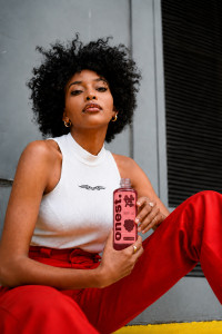
The design puts the natural ingredients front and center through a minimalist aesthetic and maximum transparency. Illustrative fruit cutouts highlight the ingredients while revealing the product itself. This makes visible what onest. stands for: authenticity, clarity, and trust. Each of the four varieties – Pear & Ginger, Apple, Mango, and Elderberry & Raspberry – features its own natural color palette.
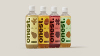
The starting point of the visual language is the dot from the onest. logo. As the brand’s defining graphic element, it functions as an image mask, a photographic cutout, or a bold graphic shape. This creates a distinctive and recognizable design language that remains flexible across a wide range of applications.
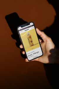
Like every startup, onest. needed to launch quickly and gather early market insights. To achieve this, we built the webshop on a carefully selected Shopify template. By adapting the interface to the brand’s visual language, we translated key design elements into the digital space and created a clear, intuitive shopping experience with a strong focus on the product.
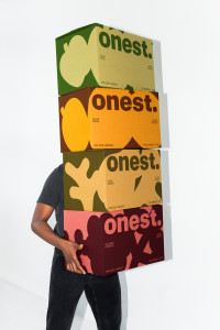
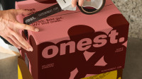
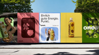
Natural and vibrant, the packaging for 12 and 24 bottles consistently extends the visual language of the products. The result is a cohesive system that creates clarity, recognition, and strong shelf presence.
“Developing the onest. brand together with BR*Studio was not only a great success, but also a lot of fun. At every stage of the process, BR*Studio managed to capture the essence of our ideas and turn them into a brand that not only looks great, but also has a distinctive character and clear identity of its own – a true stand-alone brand.”
Related Projects

From a creative idea to an identity that shapes an entire brand. Learn about how we collaborate.