
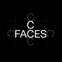
C Faces
We empower Clean Beauty brands.
Context
C FACES is the specialist in the market establishment, distribution, and marketing of international top brands in the Clean Beauty sector in the DACH region. Market leaders such as John Masters Organics, The Organic Pharmacy, and Nailberry trust the holistic all-round support of C FACES in marketing, PR, training, storage, and distribution of their natural products.
Approach
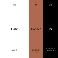
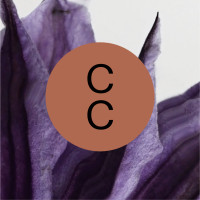
“Closeness, purity, and excellence” - These three values are the basis of the jointly developed Brand Strategy, which we brought into focus in the brand design development. The main design element is a clear, modern typography, which reflects the high quality of C Faces' services through its mid-axial typesetting. The purist design system is supported by approachable photography and a warm, earthy color scheme.
Client |
C Faces |
Photography |
Annegret Hultsch |


The most important touchpoint for customer acquisition and retention is the newly developed website, which presents C Faces and its brands in a high-quality manner.


In social media, the content of C Faces is all about cooperation. We convey this theme through the use of the cooperation sign (×) and the clear, equal division of space.


Sales are people's business: that's why we put a lot of emphasis on high-quality and approachable portrait photography.


Related Projects


From a creative idea to an identity that shapes an entire brand. Learn about how we collaborate.