
Ten Twelve
A New Care Consciousness: creating the new brand identity for a science & research driven medical skincare company.
Context
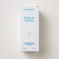
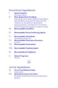
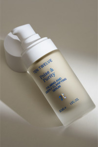
TEN TWELVE is a premium skincare brand positioned in the rapidly growing niche market of clean beauty products. Behind the innovative skincare brand is a small team of pharmacists from the Medical Valley in Germany, who have developed a patented transport system on the basis of molecular science that allows active ingredients to penetrate into the deeper layers of the skin and thus revolutionize skin care.
Approach
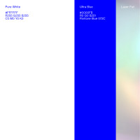
The principle behind the products is already in the name Ten Twelve. 10 selected functional substance clusters + 2 active substance clusters describe the clean and lean composition of active substances of the premium brand. The merging of opposites is the leitmotif of the progressive brand identity: nature meets science and Asian culture meets Western culture. The result: a differentiating and bold brand experience.
Client |
Ten Twelve |
Fotografie |
Studio Tusch |

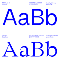
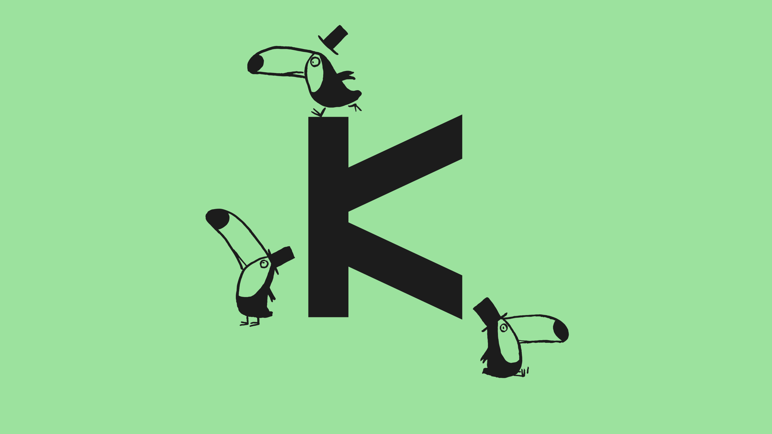
Culture Clash: In the technologically inspired image mark, the founders’ Vietnamese roots meet the Latin alphabet and translate the core of the brand into a bold and recognizable T-monogram.


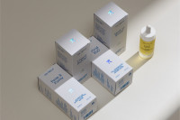


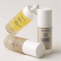

Molecular science and natural elements are at the core of Ten Twelve. Together with Studio Tusch, we translated this approach into a progressive image concept in order to stage products and textures in a digital light.


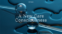
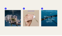
Based on Shopify, we developed the online shopping experience: Insights into research, beauty routines, and stories manifest the scientific basis and are intended to make the purchase decision easier.


Related Projects
From a creative idea to an identity that shapes an entire brand. Learn about how we collaborate.