AUG. PRIEN
Our buildings foster connections between potential, people, and a sustainable future.
Context
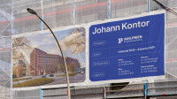
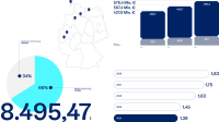
More than 150 years of tradition and experience – with a clear vision for the future. With over 800 employees across seven locations and an annual turnover of €576 million (as of 2023), AUG. PRIEN is among the 50 largest construction companies in Germany. Founded in 1873 in Hamburg as a traditional construction firm, this family-owned company now operates in four key divisions: Construction, Project Development, Investment, and blu – an innovation hub for sustainable new construction. Together, these four entities shape and oversee the entire life cycle of future-proof buildings, fostering seamless collaboration among all project partners.
Approach
To create a strong connection between our four business divisions and all aspects of modern construction, established structures had to be re-evaluated and redefined. Together with all managing directors, we developed a fundamental brand architecture – the Branded House – now led by the newly established AUG. PRIEN Group. This structure is designed to foster synergies in volatile times, providing stability and security for customers and partners. Building on this new brand strategy, we created a flexible yet consistent design toolkit that seamlessly translates the AUG. PRIEN brand into the digital age.
Client |
|
Text |
|
Code |
|
Awards |
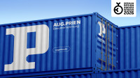
German Design Award 2026 |
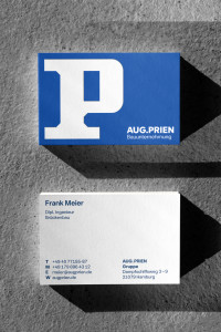
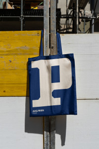
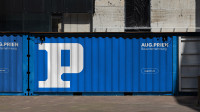
Merging experience with future-oriented building: Inspired by the strength of the steel girder, we not only modernized the classic P logo but also developed a complete design system around it.
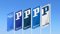
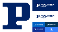
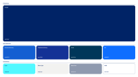
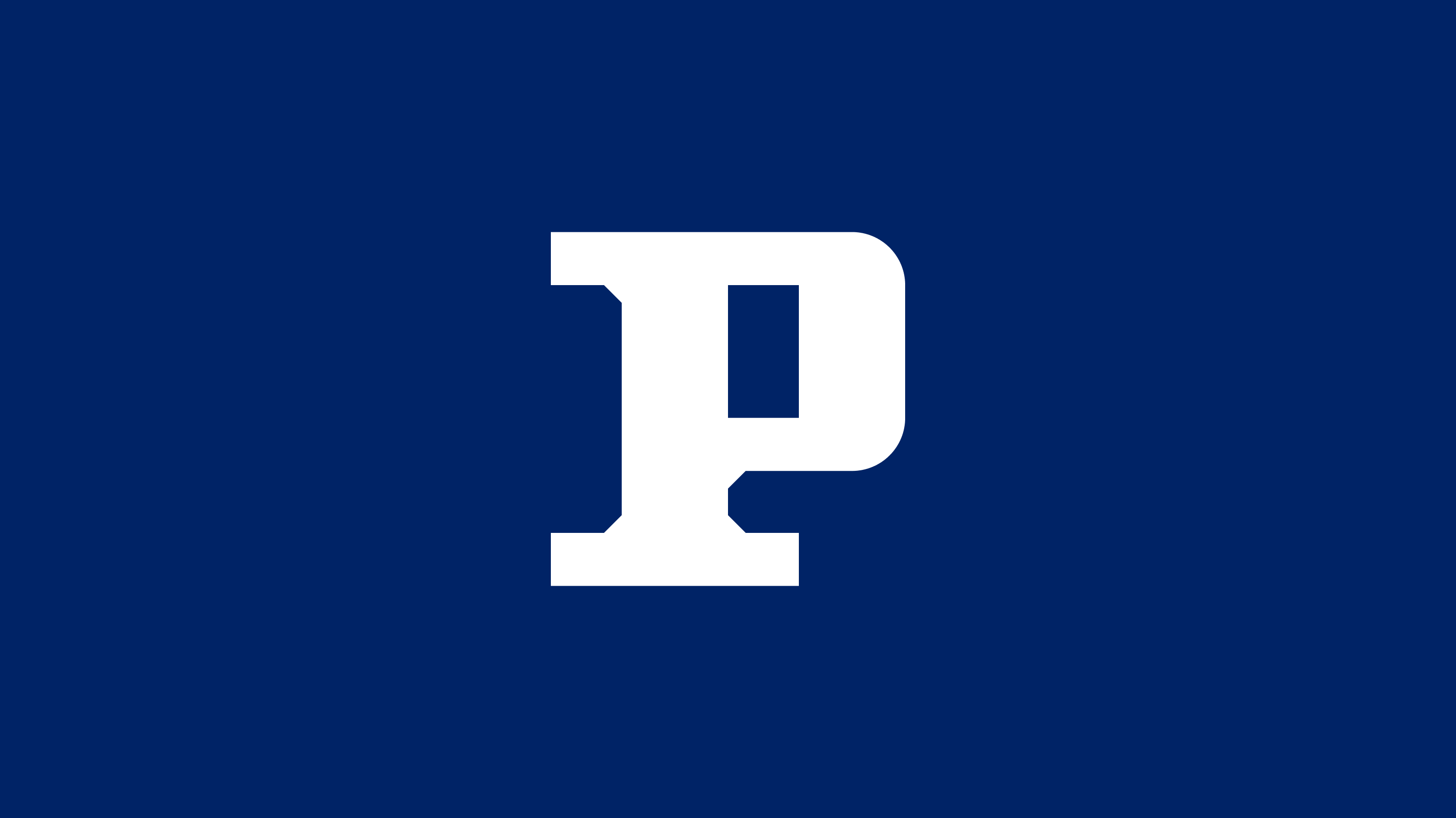
The newly designed P monogram draws inspiration from the steel beam of the classic AUG. PRIEN emblem, symbolizing the group's strength across all channels – both online and offline. A palette of five distinct shades of blue was developed to give each subsidiary its own unique identity.
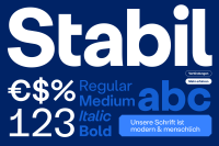
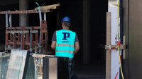
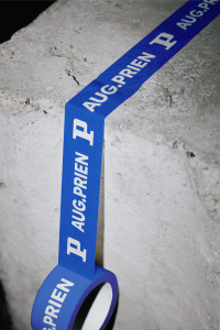
The 45° weld seams from the P logo give the newly created Icon toolbox a distinctive look: striking for use in rooms and optimized for the smallest digital touchpoint applications.

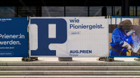
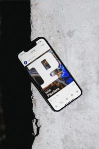
Make my logo bigger: The proud P monogram can be scaled to fill the entire space, ensuring maximum visibility and impact in communication.
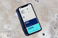
Flexibility meets stability: The newly developed design kit is optimized for digital touchpoints and provides ample room for the AUG. PRIEN Group and its subsidiaries to present themselves in a way that is both consistent and independent.
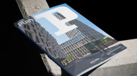
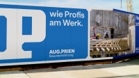
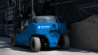
The P is the hero of communication: it not only shapes the visual design, but also reinforces the verbal identity of the brand as a continuous campaign system.

“Our collaboration with BR*Studio was a true asset from the very beginning. With outstanding dedication and creative expertise, they not only strengthened our brand presence but also provided invaluable support beyond the contractual agreement.”
Related Projects
From a creative idea to an identity that shapes an entire brand. Learn about how we collaborate.