We build strong brands and develop marketing solutions for companies in the real estate industry.
We are BR*Studio, a Hamburg-based agency for strategy, branding, digital and marketing. Our specialisation: companies, products and projects in the real estate industry. We work with asset managers, investors, construction companies, property developers, micro-living operators, housing cooperatives, real estate funds – and everyone looking to set new standards in the property market. Have a project in mind? Let’s talk
BR*Studio in Numbers




Our Benefits
In-Depth Industry Expertise
360° Brand Expertise
Owner-Managed and Personal
In-House Architecture Expertise
High Quality
Digital Expertise
AI-Powered Processes
Established Network
Long-Term Partnership
We do
Strategy
Positioning
Workshops
Naming
Branding
Websites & Apps
Branding of Buildings & Signage
Construction Site Marketing
Video & Photography
Reports & Brochures
Social Media
Visualisations
Presentations
Employer Branding

Your Project, Your Package
Not every brand needs the full programme. That’s why we offer three branding packages – from a corporate design for getting started to comprehensive brand support. Still not quite the right fit? As a real estate branding agency, we also develop tailored service packages to match your plans.
Essential
Let’s get this branding started! We develop your corporate design and create the visual foundation for your company or real estate project. We also bring it to life at one touchpoint – for example, a small landing page or brochure. Get in touch
Plus
The big plus when it comes to a professional brand presence. From strategy to digital launch, we develop a clear positioning and a distinctive branding for your real estate brand. Your new website brings both together in a unique and consistent brand experience. Get in touch
Premium
This one really has it all: from brand strategy to website – and beyond. As your branding partner, we develop, communicate and design whatever your real estate brand needs. And if you want, even logo socks for the team. Get in touch
As a real estate branding agency, we develop and design brands for companies and projects across real estate, architecture and construction. Here are a few examples.
altoba
Housing Cooperative
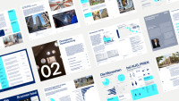
The Altonaer Spar- und Bauverein – known as altoba – is one of Hamburg’s oldest housing cooperatives and, with almost 18,000 members and around 7,000 homes, looks back on a long and successful history. Like all housing cooperatives, altoba faces the major challenges of digitalisation and the increasingly climate-neutral modernisation of its existing housing stock. To communicate future topics consistently and innovatively, and to position itself as a strong and attractive brand in Hamburg’s housing market, all design elements were revised.
Inspired by Altona’s characteristic red brick architecture, we created a flexible design system that can be used distinctively and consistently across all communications.
AUG. PRIEN
Construction Company
More than 150 years of tradition – and a clear path forward. With over 800 employees across seven locations, AUG. PRIEN ranks among Germany’s 50 largest construction companies. Founded in Hamburg in 1873 as a traditional construction firm, the family-run company now brings together four business divisions: Construction, Project Development, Investment and blu – an innovation hub for sustainable, forward-looking building. A future-proof brand architecture – structured as a Branded House and led by the newly established AUG. PRIEN Group – brings these areas together, creates new synergies and provides stability and security for clients and partners.
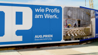
Building on this new brand strategy, we developed a flexible toolkit of design elements that translates the AUG. PRIEN brand consistently and distinctively from the analogue into the digital age.
Azur
Property Development
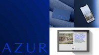
Azur is a local partner of VERMEER Residential Real Estate and acquires, sells and develops premium properties in exclusive locations around Lake Lucerne and Lake Zurich.
Inspired by the water and lakeside setting, the brand presence combines calmness, quality and timeless elegance. Shades of blue and abstracted wave circles shape the visual identity and create an exclusive brand with its own website, while benefiting from the synergies of the overarching VERMEER brand architecture.
Die Zimmerei
Microliving
85,000 square metres
3,200 units
11 residential properties
Across 10 major German cities and Vienna
An established residential portfolio owned by Bayerische Versorgungskammer (BVK) was to be optimised in terms of its digital potential and repositioned as an attractive, independent brand for a young target audience of students and young professionals. Alongside digital marketing measures, an online rental process and a free tenant app for communication, services and property management were introduced.
At the heart of the brand is the guiding idea of “joy”, translated into a bold and flexible identity featuring a distinctive initial “Z” as the key visual, confident typography and a direct tone of voice. Digital services such as the online rental process and tenant app are combined with the physical rebranding of the locations to create one consistent brand experience.
FOX Group
Investment Company
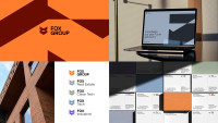
FOX Group is a Hamburg-based investment company investing in businesses across real estate, infrastructure, renewable energy and digital business models. As the umbrella organisation, FOX Group brings together different areas of expertise, perspectives and resources under one shared entrepreneurial ambition. The new brand design takes this as its starting point: making diversity visible while bringing it together as one coherent whole.
FOX Real Estate translates the group-wide brand system into a distinctive and confident identity for the real estate sector. A striking brand colour and a clear, straightforward design language create strong recognition and a particularly powerful digital presence. The flexible UI system ensures a consistent user experience and provides a future-proof foundation for the brand’s continued development.
FRANK
Property Management & Property Development
FRANK is one of Hamburg’s major long-established housing companies. Since 1925, FRANK has been developing, building, renting and managing residential properties – always with the ambition to combine quality, community and long-term viability. Today, FRANK is much more than a real estate company: it is a community built around shared values, actively shaping sustainability, social participation and a people-centred way of living together. Since 2024, we have been supporting FRANK, a company that brings together more than 20 real estate-related services under one roof.
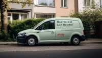
Building on the existing visual identity, we have further developed the design and use targeted marketing measures to ensure a consistent brand experience across all relevant internal and external touchpoints – from corporate presentations and campaigns to social media and service vehicles.
Hamburg13
Property Development
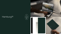
Hamburg13 is a local partner of VERMEER Residential Real Estate and acquires, sells and develops premium properties in the exclusive Hamburg neighbourhoods of Harvestehude, Rotherbaum and Pöseldorf.
The name Hamburg13 refers to the historic postal code of this area, combining strong local roots with exclusivity and an individual approach. A distinctive seal and the combination of traditional and modern design elements create an independent brand presence that still fits deliberately into the VERMEER brand world and benefits from its synergies.
HANSA Baugenossenschaft
Housing Cooperative
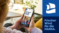
With around 14,000 members and 10,000 homes, the Hamburg cooperative is now one of the largest housing cooperatives in the city.
We are currently developing HANSA’s new digital presence. In doing so, we are translating the cooperative’s identity and values into a contemporary digital environment – with a clear information architecture, a mobile-first approach and a strong focus on accessibility.
Bald mehr dazu!
Kastanienhof
Property Development
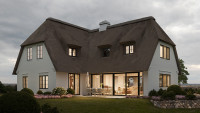
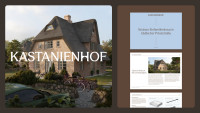
Keitum – a lively village in the east of Sylt that still retains much of its traditional Frisian character. Picturesque avenues, beautifully landscaped gardens and idyllic surroundings. Situated in this prime central location, Kastanienhof was developed as an attractive new-build detached home on a charming private road, combining modern clarity with a warm and inviting atmosphere. Contemporary, bright and functional. Modern features and high-quality materials position the property firmly in the premium segment.
For Kastanienhof, we developed the property branding as well as a marketing brochure that not only presents the functional qualities of the property, but also makes its emotional benefits tangible through a distinctive visual identity.
Küstenperle Strandhotel & Spa
Hotel
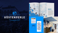
Küstenperle is a four-star beach hotel and spa located on Büsum’s Perlebucht bay. The family-run hotel features 92 rooms and suites as well as the Deichperle restaurant, Schneiders bar and Spa-Perle, a spacious spa and wellness area.
For Küstenperle, we developed a brand identity that interprets the traditional and regional values of Germany’s North Sea coast in a modern and distinctive way. Maritime illustrations, a tone of voice influenced by the local Dithmarschen Low German dialect and a consistent wayfinding system come together in a characterful identity that extends seamlessly from the physical space and print materials to the digital experience. The result is a contemporary expression of northern German hospitality that feels personal, authentic and deeply rooted in the region.
Living Lorens
Property Development
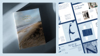
On behalf of Sylt-based property developer and estate agent Mogck+Partner, we developed the “Living Lorens” property branding for a historic brick building in Westerland. Both design and content bridge the building’s history and its careful modernisation – with a maritime feel, poetic chapter openers and a logo derived from the typography of the historic site plan. We also created a high-quality 52-page sales brochure.
Main-Taunus-Zentrum
Property Development
For Main-Taunus-Zentrum and ECE Group, we developed an interactive sustainability rally for children – engaging, playful and educational. Leading the way is Spike the hedgehog, our lovingly designed rally guide, who takes children through a series of themed stations covering topics such as circular construction, water conservation and bat habitats.
The experience is brought to life on site through specially designed information pillars. QR codes also allow both children and adults to discover additional digital content, including videos, a short knowledge quiz and more.
Mogck + Partner
Real Estate Agency
Sophisticated, trustworthy – and as individual as the island itself. The team at Mogck+Partner has known for many successful years what makes the brokerage, marketing and development of real estate on Sylt so unique.
For M+P, we developed a brand that is as unmistakably distinctive as Sylt and its properties. Based on a brand strategy, we created a clear design system inspired by the island’s nature and architecture. From the website to individually developed tools for property marketing, we implemented the brand consistently across all touchpoints.
Pecuria
Real Estate Investment
PECURIA specialises in investments in high-quality, sustainable care properties – a combination already reflected in the name, which brings together “Pecunia” (investment) and “Curia” (care).
At the heart of the branding is a distinctive symbol that subtly references the medical context while creating a premium, independent mark that inspires trust. A clear, reduced design language translates PECURIA’s ambition into a modern visual identity and ensures strong recognition across all applications, bringing together the values of security, quality and care.
Placed
Digital Property Management
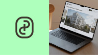
Placed stands for digital property management that makes renting and living simple: innovative, modern – and driven by a clear vision. Guided by the idea of “Better Living”, Placed improves tenants’ satisfaction and quality of life through smart, user-friendly digital services.
For Placed, we transformed Reos’ digital property management offering into an independent B2C brand. At its core is the idea of connecting tenants with their homes, their neighbourhoods and their property management. The result is a warm, modern brand world extending from the brand design to the digital tenant app.
Quipped
Smart Building
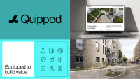
Quipped is the B2B tech brand of the REOS Group and builds on the group’s many years of experience in the digitalisation and value enhancement of residential real estate. Quipped supports both companies within the group and external clients in implementing value-enhancing measures across existing property portfolios.
Building on the REOS brand architecture, the branding translates the guiding idea “Equipped to build value” into a reduced, precise design language with a distinctive upward-facing logo.
Reos
Digital Property Management
As a digital property manager, Reos stands for efficient and sustainable property management. Through intelligent building control, cloud-based processes and the use of real-time data, the company is taking a new approach to both technical and commercial property management. An innovative tenant app also makes digital living tangible for residents.
For the Hamburg-based PropTech company, we strategically evolved the brand into an umbrella brand and created a distinctive brand design with a strong focus on digital touchpoints, bringing together technology, innovation and real estate.
Stadion am Rothenbaum
Property Development
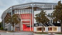
The historic tennis tournament at Rothenbaum in Hamburg has been held since 1892 and has welcomed some of the biggest names in tennis, including Boris Becker, Steffi Graf, Roger Federer and Alexander Zverev. In 2019, a comprehensive modernisation programme with an investment volume of around €10 million was launched, spanning everything from the retractable roof of the centre court to the restroom facilities.
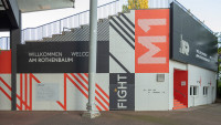
As part of the extensive modernisation of the Tennis Stadium at Rothenbaum, we developed a new visual identity that combines the history of this tradition-rich venue with a contemporary, international look. A colour-coded wayfinding system based on cardinal directions, bold graphics and typography inspired by the court markings create clear orientation and a strong visual identity. The “Walk of Champions” also brings the long tennis history of Rothenbaum to life.
Sylter Kliff
Property Development
Sylter Kliff is a local partner of VERMEER Residential Real Estate and acquires, sells and develops premium properties on Sylt.
From the brand identity to the website, the brand presence combines the distinctive character of the island with the ambition of exclusive real estate projects. The compass serves as a symbol of orientation and expertise. A colour palette inspired by Sylt’s natural landscape gives the brand its distinctive character while maintaining its connection to the VERMEER brand family. In this way, Sylter Kliff benefits from the synergies of a well-structured brand architecture.
VERMEER VENTURES
Investment Company
Three ventures, one vision: shaping the future together. VERMEER VENTURES strategically leverages synergies across its three subsidiary brands – Residential Real Estate, Commercial Real Estate and Investment – to respond to the needs of tomorrow.
For VERMEER VENTURES, we developed a brand architecture and branding system that visually translates the values of exclusivity, trust and clarity while remaining flexible for future ventures. VERMEER Residential Real Estate acquires, sells and develops premium properties in Hamburg, Sylt and Zurich. For these locations, the local partner brands Hamburg13, Sylter Kliff and Azur were created: distinctive in their own right, yet based on the design system of the umbrella brand. A modular white-label website system additionally ensures a consistent digital brand presence. Complex structures – solved efficiently and with synergies in mind.
Wullkopf & Eckelmann
Real Estate Agency & Property Management
Wullkopf & Eckelmann is a family-run real estate company based in Hamburg. Since 1964, W&E has focused on personal, authentic advice and close client relationships. Its range of services spans valuation, sales and lettings, the management of residential and commercial properties, and support for new-build developments. With more than 60 years of experience, over 10,000 properties marketed, around 45 employees and more than 3,000 units under management, Wullkopf & Eckelmann is firmly established in Hamburg’s real estate market and is one of the sector’s fastest-growing players.
The new brand identity translates this positioning into a contemporary visual language, with the compass as its central guiding idea – a symbol of orientation, reliability and finding the right path between people, property and the future.
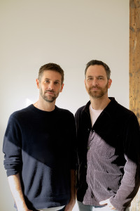
“The real estate industry is facing major challenges. That is exactly what makes it so exciting for us. We believe that strongly positioned brands can make a real difference and create measurable value. That’s why we have focused our experience and passion on this industry.”
Tim Rotermund & Stefan Bräutigam
Founders and Managing Directors
What our clients say

“Working with BR*Studio was an important step in our development. Through an in-depth exploration of our history and company DNA, we created a clear, contemporary brand identity that feels authentic to who we are. What impressed us most was the individual, strategic approach, with honest discussions and no rigid templates. The result is a visual identity that does not feel constructed, but genuinely evolved from within our company.”
Employee Pride
Apps integrated into the Website

“Together with BRStudio, we sharpened our brand architecture and developed a modern identity that gives our group greater visibility and positions it for the future. We particularly value the strategic advice, solution-oriented collaboration and open exchange on equal terms. Even after the relaunch, BRStudio continues to support us in developing our brand and remains a reliable strategic partner.”
under one Roof
Award

“BR*Studio understands branding and speaks the language of the real estate industry. That is what makes them stand out. Since 2020, we have developed five brands together – from strategy, naming and brand design to websites, apps and marketing – all tailored precisely to their respective target audiences.”
of Collaboration
new Brands

“Thanks to BRStudio, we have established a strong and lasting position as a premium real estate agency on Sylt. Today, Mogck+Partner is perceived with much greater confidence, which is reflected in our increased sales volumes. And because BRStudio also supports our own real estate projects, what began as branding has evolved into a holistic brand approach.”
Google Page Rank
Establishment of a New Premium Price Category Within the Portfolio

“Four years, and not once did we have to follow up. BR*Studio combines strategic clarity with genuine creativity and collaborative consulting – and delivers on every deadline. Proactive, reliable and always to the point. For us, they are the benchmark against which we measure other agencies.”
working together
Social-Media-Templates in 2026




Project Enquiries
Are you planning a new real estate project or looking to develop an existing brand further? Let’s talk.